Visual Identity
Our visual identity reflects our mission, vision, and values, combining colors, symbols, and design elements that represent who we are and what we stand for:

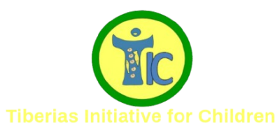
-
- Colors:
- Green: Hope and aspiration for a brighter future.
- Yellow: Development and growth.
- Blue: Long-term vision and stability.
- Symbolism in the TIC Acronym:
- T: Represents a person—a joyful child welcoming their parent or a member reaching out with open arms. The “T” recalls the Franciscan Cross or the shape of the true cross, symbolizing sacrifice and service. It also connects to the miracle of the five loaves and two fish, emphasizing generosity and the multiplication of blessings.
- i & c: Stand for Me & Community, emphasizing collaboration.
- The dot on the “i” represents the child’s head, symbolizing their importance as the priority.
- The connected “i” and “c” highlight the bond between the member, the child, and the community.